Portfolio
Wanna see something cool?
Hi. I'm Caroline.
A digital maker for hire.
The time a multi-national software company wanted to have some fun
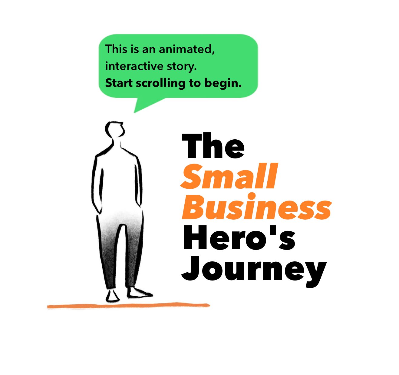
As part of an ongoing relationship with Quickbooks, the accounting software people, I was invited to create an interactive, scrollable story to describe the trials and tribulations of a small business owner - The Small Business Hero's Journey.
I worked alongside long-time collaborator Jo Harrison, who created the wonderful illustrations and animations for the piece.
Making the work weird and the weird work.
The client provided a loose script and suggestions for animations, but they were open to suggestions and experimentation.
The page was created using a combination of self-contained animations (GIFs) as well as scroll and click triggered interactions. This kept the reader engaged, and invested in the story.
“people loved using your scrolly installation and immersed themselves fully in the piece ... so many people finding quiet moments to jump into your world. I am so pleased you were part of this project”
– Natasha Higdon (The Writers Mark)
The time I created an online journey of
self-discovery
I was invited to create a digital piece of work for Leonora's Banquet - a group art exhibition and theatre performance inspired by the surrealist Leonora Carrington.
I created Glitch - fuelled by my research into the surrealists, and seeing them as social hackers, glitching the system with a message that still resonates today - especially to maginalised voices.
It was exhibited as part of Brighton Fringe 2025.
Making the work weird and the weird work.
Using Vev, I created a scrollytelling piece, with interactive elements and a strong narrative.
We follow the journey of Glitch, a floating head travelling through a journey of othering, oppression, masking, finding family, rebellion and transformation were part of their world.
The installation itself lent to the surrealists-as social hackers inspiration (but also a nod to the Regency Town House setting of the exhibition) - neon lights, candles, bright lampshades, hacker books and Neon Moon tarot cards.
“people loved using your scrolly installation and immersed themselves fully in the piece ... so many people finding quiet moments to jump into your world. I am so pleased you were part of this project”
– Natasha Higdon (The Writers Mark)
The time I helped a little eel get home .. and everyone cheered

The Story of Sarga is a scrollytelling epic for kids about the migration of the American Eel.
Live audiences watched as our hero, Sarga, swam from the Sargasso Sea through rivers and dams—cheered on every step of the way.
And then she hit a dam. The scroll—and the story—turned.

My kind of problem → my kind of fix
The story sees our hero, Sarga, hit a dam - her first real trial. For many eels, this is the end. What will she do?
I used VEV’s horizontal scroll right at the moment Sarga’s path was blocked.
The screen shifts. Sarga noses along the dam. You feel the tension. And when she finds a way through - so does the story.
The kids loved it. The client loved it. I loved it.

The time I put the reader in the hot seat - and made them sweat
Zoom were launching new customer service tools with a sponsored article via Sifted. The brief to me? Add some scrollytelling polish - parallax, animations.
Instead of just polish, I pitched something bold - a playable moment inside the article.
Most readers had never worked in support. They couldn’t feel the pressure the tools were meant to relieve.
So I gave them a taster of the problem they're trying to solve ... a short, playable game in the middle of the article - just 10 seconds of chaos as you, the customer service agent, try to catch every incoming request.
You burn out. (Spoiler: you ALWAYS burn out).
And that's kinda the point, right?
My kind of problem → my kind of fix
Can I speak to
a human!!?!??

Who's in charge??!?!
This company sucks
I've moved house
Can I speak to
a human!!?!??
Who's in charge??!?!
This company sucks
I've moved house
Can I speak to
a human!!?!??
I wrote the wrong email address
I wrote the wrong email address
Who's in charge??!?!
Why is this taking so long?
Can I speak to
a human!!?!??
Why is this taking so long?
Can I speak to
a human!!?!??
Who's in charge??!?!
This company sucks
I've moved house
Can I speak to
a human!!?!??
Who's in charge??!?!
This company sucks
I've moved house
Can I speak to
a human!!?!??
I wrote the wrong email address
I wrote the wrong email address
This company sucks
Who's in charge??!?!
Why is this taking so long?
Can I speak to
a human!!?!??
Why is this taking so long?
Can I speak to
a human!!?!??
Who's in charge??!?!
This company sucks
I've moved house
Can I speak to
a human!!?!??
Who's in charge??!?!
This company sucks
I've moved house
Can I speak to
a human!!?!??
I wrote the wrong email address
I wrote the wrong email address
This company sucks
Who's in charge??!?!
Why is this taking so long?
Can I speak to
a human!!?!??
Why is this taking so long?


Help Raveena get to the messages in time by moving her around the screen.
Raveena
and
"The Customer"
Click to play

Game over.
You burnt out.
“You anticipate needs, bring fresh ideas, and are always a few steps ahead…”
– Client feedback from Sifted
When I make a time machine ... out of a touchtable?!?

MyRoute was a touchtable timeline built for Sampad’s major community heritage project on Stratford Road, Birmingham.
Think: history-meets-interface. Like flicking through your neighbourhood’s photo album - but on a screen you could touch, explore, and share.
I wanted people to grab time. To trace their street, their landmarks, their memories - layered across decades. Not just look back, but look through.
My kind of problem → my kind of fix
I designed an interactive map where people could swap between decades and explore through themes like food, family, and faith.
You could even hand someone a “lens” to change the view - literally passing perspective.
I led the concept and content, collaborating with the touchtable designer to bring this multi-voiced, multi-decade story to life.


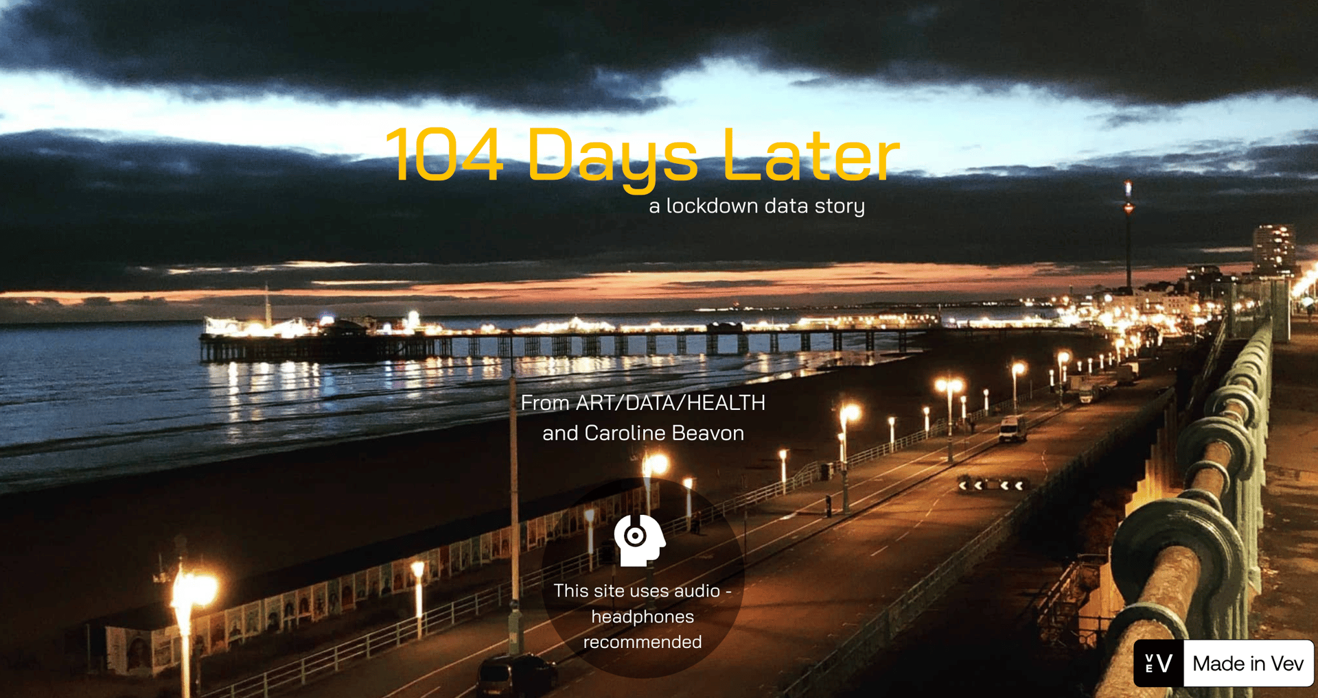
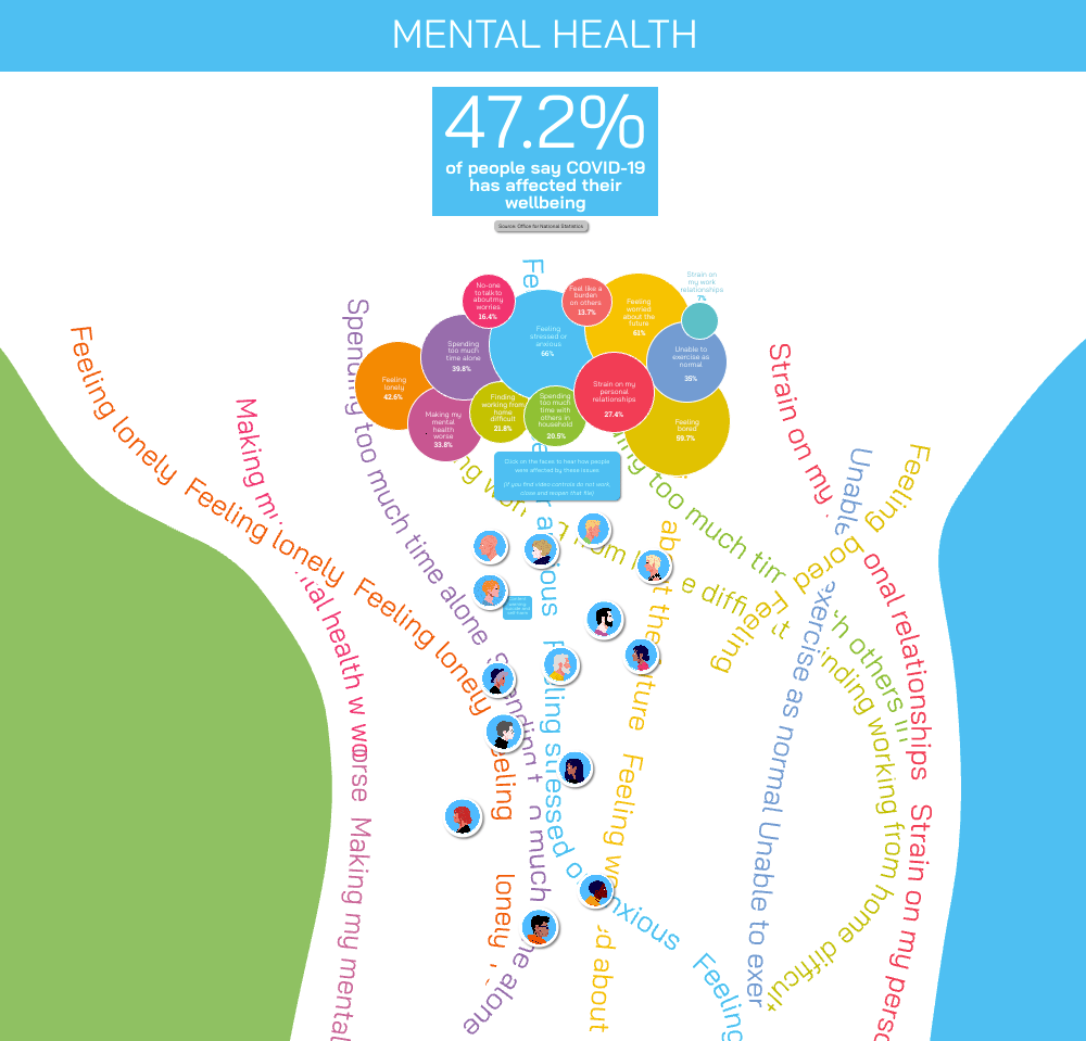
When I turned the lockdown experience into a map of feelings
Commissioned by the University of Brighton’s ART/DATA/HEALTH project, 104 Days Later was designed to capture the UK’s lockdown experience—while we were still in it.
My kind of problem → my kind of fix
This wasn’t post-pandemic reflection. It was real-time meaning-making.
Data was being released. Stories were still unfolding. I was living it - and building it.
I created five immersive journeys through pandemic data, each one designed to feel like the experience it represented.
The mental health section opened with a bubble chart - ONS figures on stress, boredom, and loneliness. From there, the story frayed into coloured threads: tangled paths of overlapping issues.
Click a face, and you heard a real voice. No summary. No commentary. Just presence.
Built in VEV. Designed during lockdown.
Interaction as empathy.
Narrative capturing a unique moment in time.
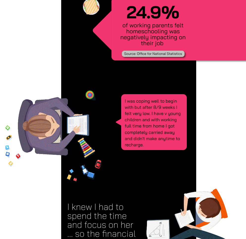
When I built a city, a crisis, and a kitchen table out of data
As part of the ART/DATA/HEALTH commission, I was tasked with turning pandemic data into an interactive narrative.
But the real challenge?
Capturing the radically different environments we were all suddenly confined to—and making them readable, relatable, and distinct.
My kind of problem → my kind of fix
I split the experience into core topics, each one anchored in a physical metaphor:
Financial health lived on a horizontal street—a visual neighbourhood of inequality, where buildings held stories through data, speech bubbles, and video quotes.
Working from home became a vertical kitchen table, seen from above. Scroll down and you move through the compressed chaos of daily life - Zoom calls, meals, homeschooling, coexisting.
Mental health - this emotional data wove together nto tangled threads representing the very complex issues aces, but overlaid on a coastal background. many people in Brighton sought solace on the beach during this time.


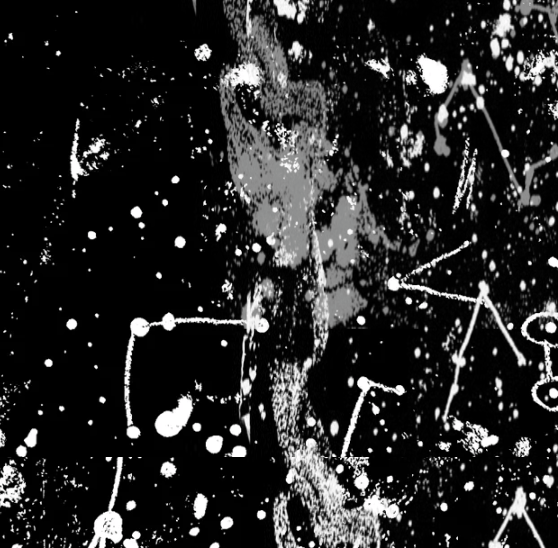
When a children's story took a very dark and surreal turn
In 2024, I joined a week-long Instagram art challenge to reinterpret scenes from Pinocchio.
In a world where AI can churn out flawless, polished illustrations, I used this challenge to make something weird, messy, and unmistakably human.


Making the work weird and the weird work.
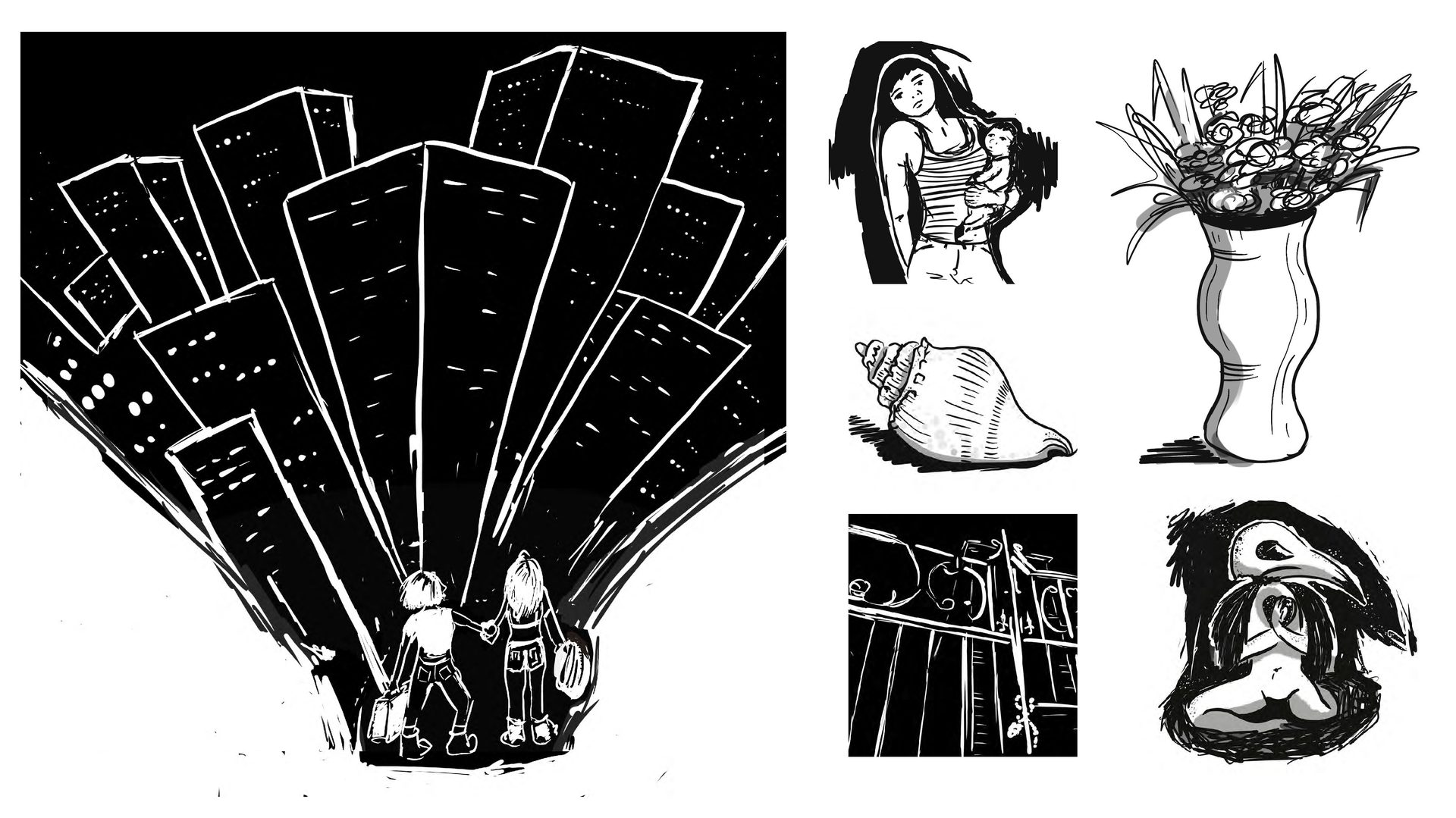
I treated each prompt not as an illustration brief, but as a character design challenge—building surreal figures from real-world textures and symbolic objects.
The doctor? Made of pill packs, bones, and a leather bag.
The fish? Composed from a photo of the sea at sunset.
A hoard of excited people? Teasels, shadows, ... crowding-chaos
I photographed natural and household items, then layered and manipulated them in Procreate—using the materials’ textures to create semi-recognisable but emotionally uncanny forms.
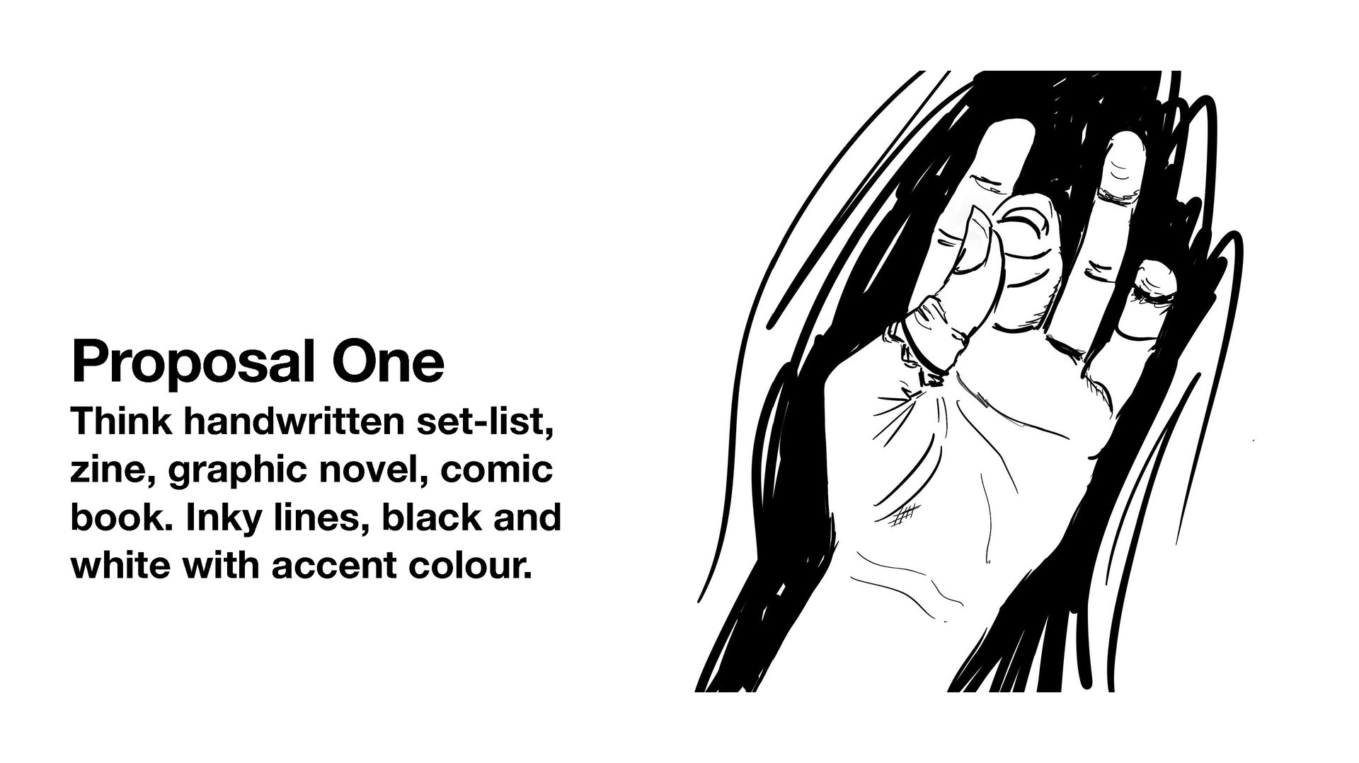
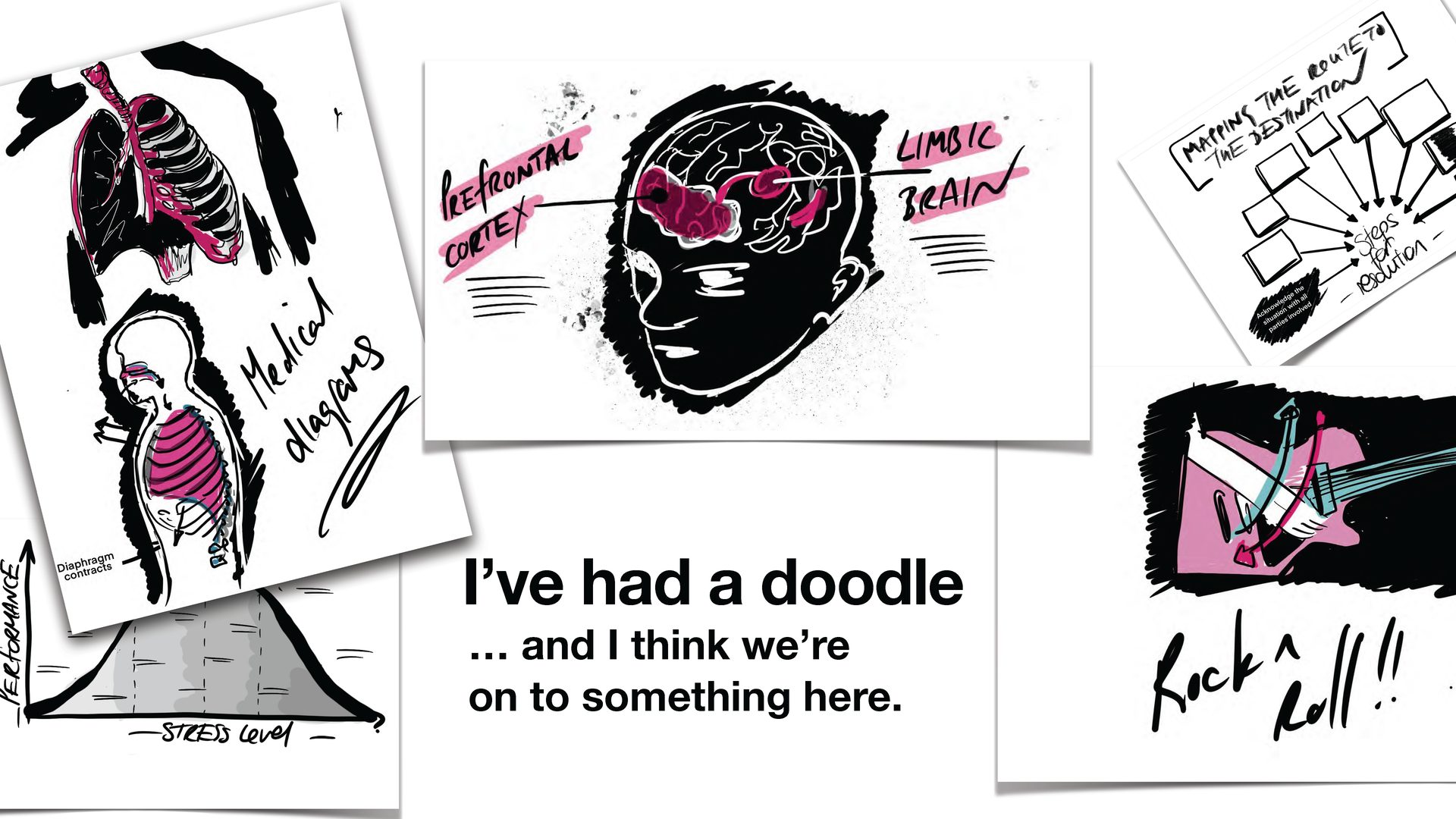
That time I pitched a punk-rock medical book.
A publisher appreoached me to illustrate a book on musician wellbeing. The content? Smart, grounded, important.
The problem? It looked like it was heading straight for textbook territory.
So I pitched a different vibe:
Handwritten setlists. Zine aesthetic. Graphic novel grit.
I proposed 25 illustrations that felt lived-in, loud, and real - something musicians could recognise, not just read.
They loved it.
In the end, they went another way.
But this one still lives rent free in my brain.
My kind of problem → my kind of fix